Design and build notes
The First Owner's Reference
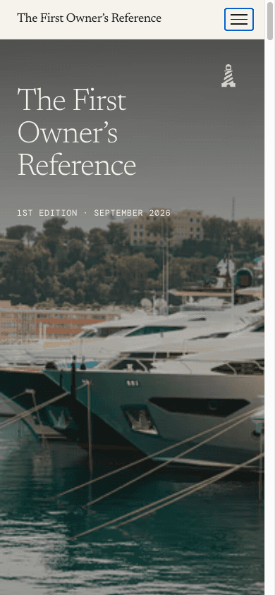
An annual publication for first-time superyacht buyers, where one typed content source produces both the website and a 120 page casebound book.
- Client
- The First Owner's Reference
- Sector
- Editorial publishing
- Year
- 2026
- Scope
- Editorial system design, Web design, Development, Print typography, Press build pipeline
The commission
This is a publication rather than a marketing site. The reader is someone approaching a first superyacht purchase and treating it as a private decision, and the work had to serve long reading on screen, accurate citation by other professionals, and a print edition of genuine quality, all from the same material.
Existing yachting media is written for the trade. The tone is breathless, the structure is that of an auction catalogue, and a first-time buyer reading it would learn little and trust less. The Reference was conceived to fill that gap, which meant the design problem was an editorial one before it was a visual one.
- •Nine chapters, each a complete piece of editorial rather than a section of a brochure.
- •One content source producing the website and a press-ready book, with no dual maintenance.
- •Structured data on every chapter and every defined term, so the content can be quoted correctly.
- •A publication that takes no advertising, recorded as a position in the colophon.
- 3 May 2026First commit, and the wireframeThe structure of Edition One set out before any design work
- 3 May 2026Lead essays drafted for every sectionEditorial first. The publication was written before it was designed
- 8 August 2026Print galley disciplineThe imagery pass and the rule against mid-flow column spanners, both print typography problems
- 8 August 2026Proof corrections, round twoVerifications, case arithmetic and the sources hazard checked again
- 8 August 2026120 page proof built230 by 300mm trim, the reading proof, the CMYK master and the press block from one command
- 10 to 11 August 2026Studio editorContent migrated to JSON with typed loaders, so the publication can be edited without a developer
- Commits
- 297
- First to latest
- 15 weeks
- Chapters
- 9
- Proof extent
- 120pp
Dates taken from the project's commit history. The proof date and extent are recorded in the print folder.
The masthead
The masthead is the wordmark. It is set in Newsreader at its light 300 weight, with the strap line, A yachting field manual, beneath it in the same face italicised. There is no drawn logo and nothing else identifies the publication.
It is typeset rather than drawn, and appears as live text wherever it is used. That keeps it selectable, searchable and accessible, and it means the masthead cannot drift out of step with the body typography, because it is the body typeface. On the print edition the same wordmark is foil stamped on the case.
The First Owner’s Reference
A yachting field manual


The publisher's mark is the Foreland lighthouse. Measured from the path data it is identical to the mark on the parent company's site, 72.01 by 120 units on a 200 unit square, a ratio of 0.600 to 1. That is deliberate: the Reference is published under the Foreland Marine umbrella, and using the same artwork rather than a redrawing is what makes the relationship legible at a glance.
- Aspect ratio
- 0.6 : 1
- Measured from the drawn path
- Construction module
- 24 units
- A fifth of the mark height
- Artboard
- 200 × 200
- viewBox units
- Drawn ink
- 72.01 × 120
- Air, top and bottom
- 40 units each
- Air, left and right
- 64 and 63.99
- Colourways
- Charcoal and paper
The mark carries its clear space on the artboard rather than in a written rule. Forty units of air sit above and below the drawing on a 200 unit square, so placing the file at any size and butting other elements to its edge still leaves a third of the mark height as breathing room. Clear space that is drawn into the file is clear space nobody has to remember.
x = the built-in artboard margin, 40 units on the artboard.
14px20px28px40px72px140pxThe publisher's mark down to favicon size. It is a narrow, vertical drawing at 0.600 to 1, so it is the height that runs out first rather than the width. The beam is the first detail to close up, which is why it is drawn as a small number of heavy strokes rather than fine rays.
Because the masthead is typeset rather than drawn, most of what would normally be logo misuse cannot happen here: there is no file to stretch and no artwork to recolour by accident. The restrictions that remain are about the two things that can still go wrong, which are the face and the ownership of the mark.
One further rule is editorial rather than visual. The masthead is set in Newsreader Light and nothing else, and it is never substituted with a display face for a campaign or a cover. Because it is live text in the body typeface, a substitution would be visible immediately against the prose beneath it, which is a useful property for a publication that will outlive whoever is setting it.
Colour
The palette treats the screen as paper. The ground is a warm off-white rather than white, text is near black rather than black, and a single marine blue carries headings, links and drop caps. Stone handles metadata and captions, and a warm rule colour draws the hairlines that structure the page.
Each colour has a deeper partner, so contrast can be raised without introducing a new hue. The print edition uses slightly warmer versions of the same tokens, because ink on uncoated stock reads cooler than the same value on a backlit screen.
Paper
#F5F2EC
245, 242, 236
The page
Paper deep
#EDE8DF
237, 232, 223
Alternating bands and callouts
Charcoal
#1A1A1A
26, 26, 26
Editorial text
Charcoal soft
#2A2A2A
42, 42, 42
Secondary text on paper
Marine
#0F3B5C
15, 59, 92
Headings, links, drop caps
Marine deep
#0A2A44
10, 42, 68
Immersive grounds
Sail
#4A7DA9
74, 125, 169
Links on dark grounds
Stone
#7A756D
122, 117, 109
Metadata and captions
Rule
#D8D2C4
216, 210, 196
Hairlines and dividers
Measured contrast
| Pair | Sample | Ratio | WCAG 2.1 |
|---|---|---|---|
| Charcoal on paper | Sample text | 15.6:1 | AAA |
| Marine on paper | Sample text | 10.4:1 | AAA |
| Stone on paper | Sample text | 4.1:1 | AA large |
| Paper on marine | Sample text | 10.4:1 | AAA |
| Sail on marine deep | Sample text | 3.4:1 | AA large |
Ratios are computed from the hex values on this page under WCAG 2.1, not quoted from the brand document.
Typography
Three families divide the work. Newsreader carries the masthead and all editorial prose. DM Sans handles signposting, which is to say chapter numerals, navigation and metadata, set in letter-spaced capitals. DM Mono sets the numbers, tabular wherever money is involved, so a column of figures aligns on the decimal without anyone having to think about it.
Newsreader
Masthead and editorial prose
Light 300 for the masthead, up to 500 in chapter headings, italic for the strap line and pull quotes. It carries old-style figures and standard ligatures throughout.
DM Sans
Signposting
Chapter numerals, navigation and metadata in letter-spaced capitals. It never sets a paragraph.
DM Mono
Numbers
Tabular numerals for cost tables and the calculators, where alignment matters more than colour on the page.
ABCDEFGHIJKLMNOPQRSTUVWXYZ
abcdefghijklmnopqrstuvwxyz
0123456789 & £ € , . ; : ( ) “ ”
The first year of ownership is the year in which the assumptions made during the purchase are tested.
| Step | Size | Role | Family | Weight | Line height | Tracking | Set |
|---|---|---|---|---|---|---|---|
| display | clamp(3rem, 6vw, 6rem) | Display | Newsreader | — | 1.02 | — | Aa |
| headline | clamp(2rem, 3.5vw, 3rem) | Headline | Newsreader | — | 1.1 | — | Aa |
| title | clamp(1.5rem, 2.2vw, 2rem) | Title | Newsreader | — | 1.2 | — | Aa |
| subhead | 1.125rem / 18px | Subhead | Newsreader | — | 1.4 | — | Aa |
| body | 1.125rem / 18px | Body | Newsreader | — | 1.65 | — | Aa |
| small | 0.875rem / 14px | Small | DM Sans | — | 1.5 | — | Aa |
| meta | 0.75rem / 12px | Metadata | DM Sans | — | 1.4 | — | Aa |
Body type is set at 18 pixels rather than the 16 that most sites use, on a 1.65 line height, because the reader is expected to stay with a chapter for twenty minutes rather than scan it. Paragraphs are hyphenated with limits set so that no word breaks with fewer than four characters on a line, which is a print convention rarely carried across to the web.
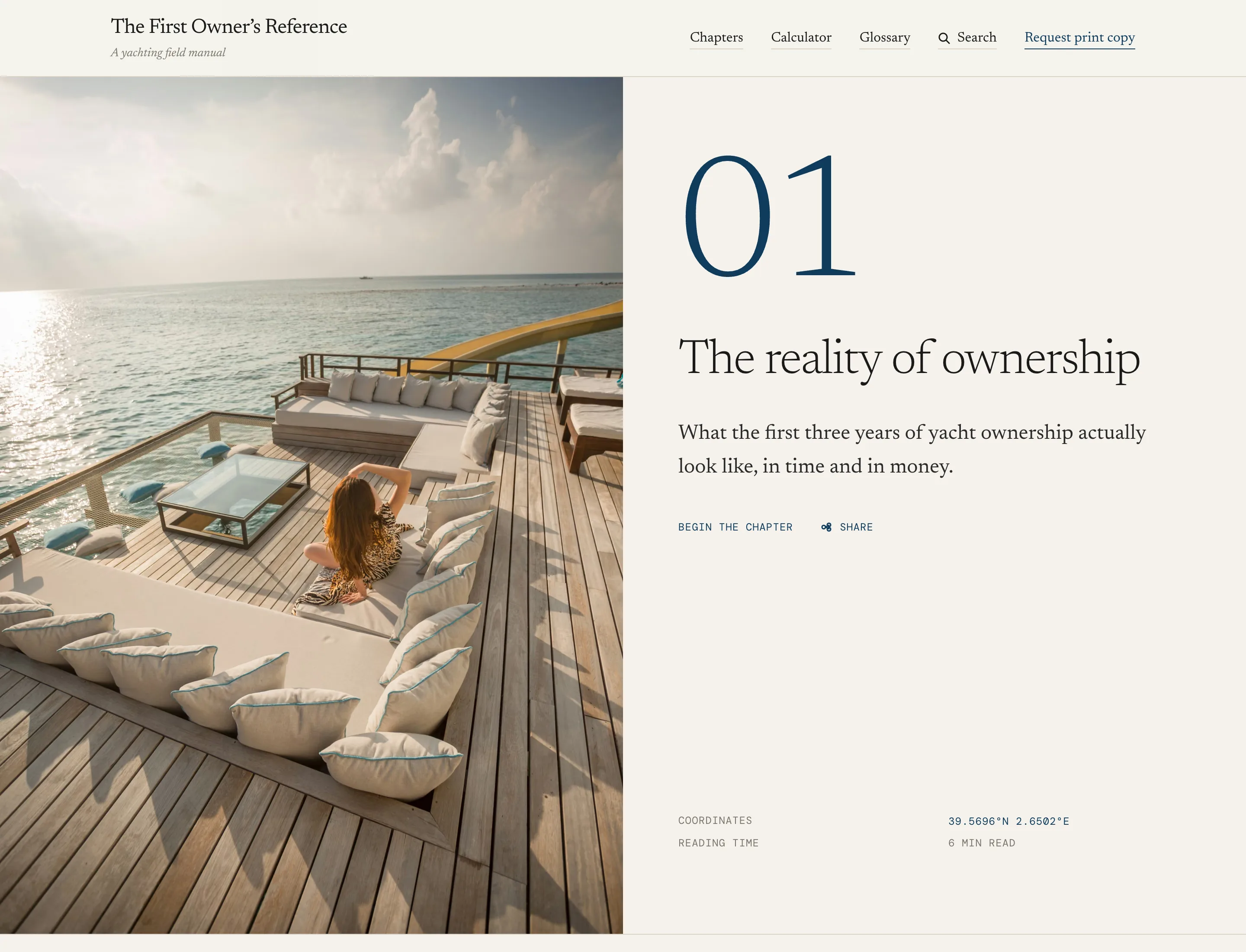
Layout
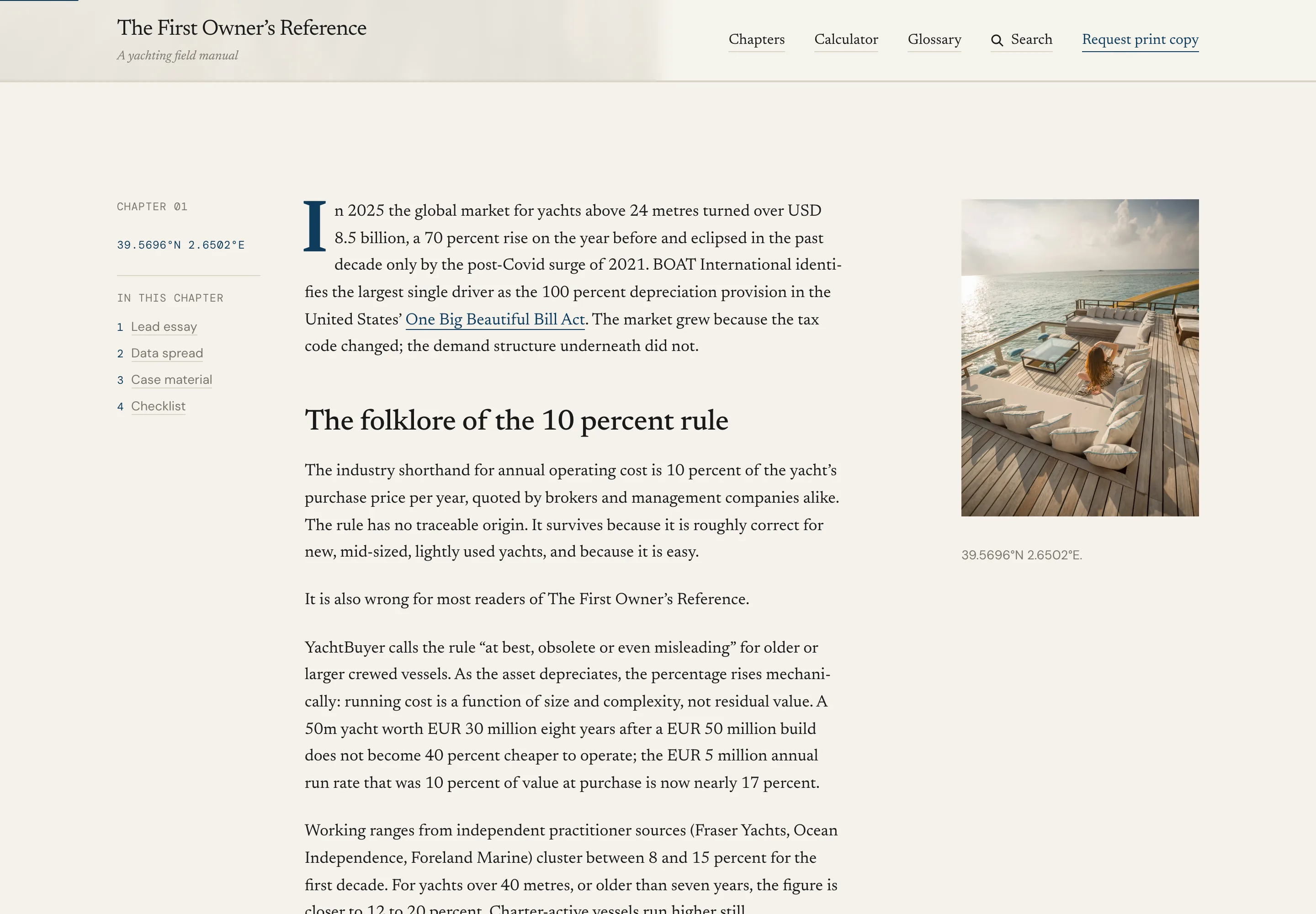
The layout serves long reading above everything else. A single column runs at a 38rem measure, which lands between sixty and seventy-five characters a line at body size. A rail of 22rem carries footnotes, sources and figures alongside the text at desktop width and folds beneath it on a phone. The page container stops at 80rem.
Prose column plus a 22rem rail for notes and sources
Rail folds beneath the prose
Single column, notes inline
- Prose measure
- 38rem
- Note rail
- 22rem
- Page container
- 80rem
- Body size
- 18px
- Body line height
- 1.65
- Drop cap
- Marine, chapter opener
- •Drop caps are set in marine on the first paragraph of each chapter, matching the print edition.
- •A scroll progress bar runs across the top of a chapter, because a reader who has committed twenty minutes deserves to know where they are.
- •Navigation strips between chapters carry the previous and next chapter titles rather than arrows alone.
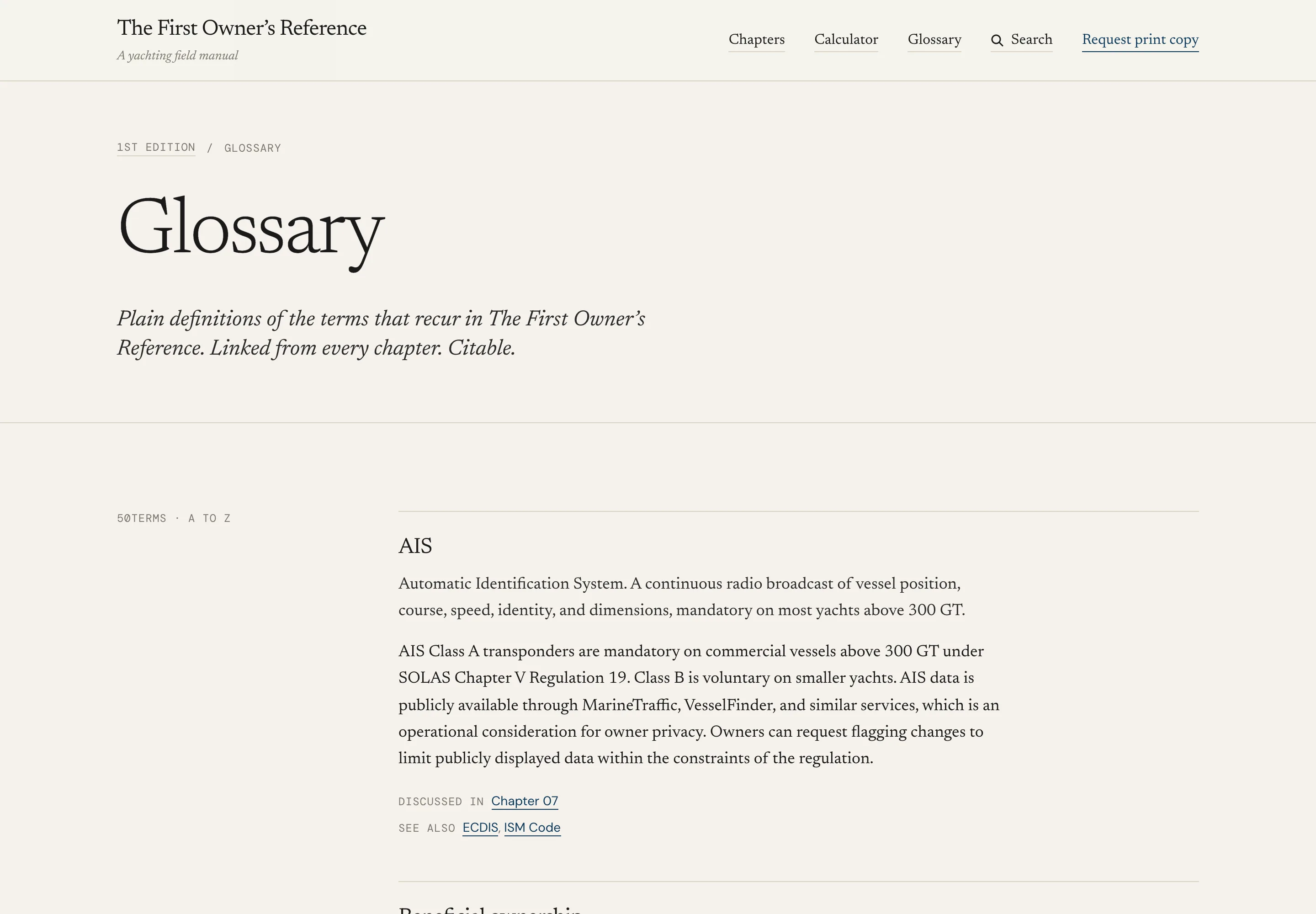
- •Every defined term in the glossary is auto-linked on first use in the body, without an editor marking it up.
The publication
Nine chapters form the spine, running from the reality of ownership through the market, how the industry works, acquisition, new build against brokerage, refit, operations, motor against sail, and a closing decision framework. Each chapter is a complete piece of editorial in its own right: a lead essay, a data spread, a guest opinion, an anonymised case and a printable checklist.
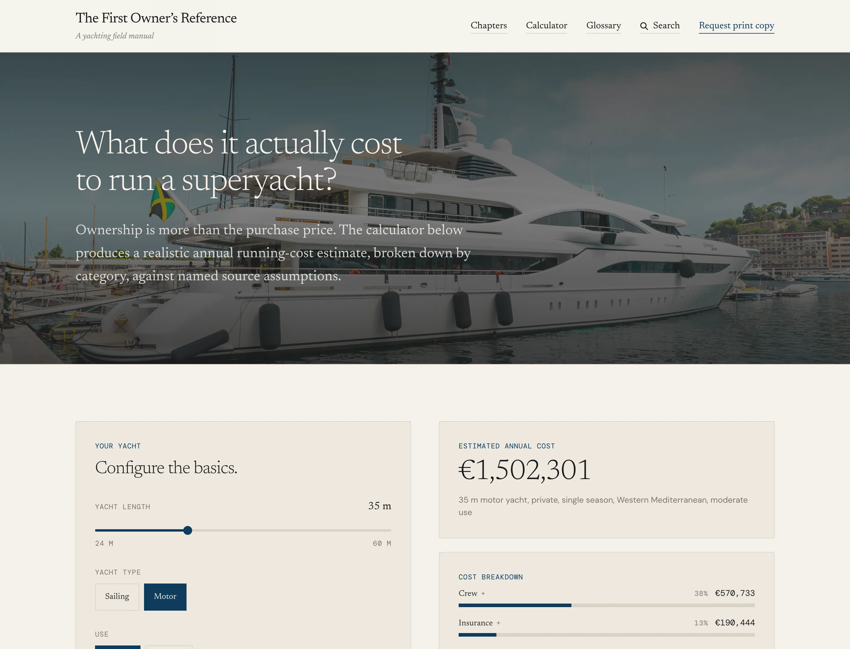
Around them sit a glossary of fifty defined terms, each with its own page and its own structured data, a search that covers the whole publication, and four working tools built on published industry data.
What was shipped
- Nine chaptersEssay, data spread, guest opinion, anonymised case and checklist in each
- GlossaryFifty terms, each with a page and DefinedTerm schema
- Running cost calculatorBuilt on sourced industry figures
- Captain and crew salary, 2026Published pay data by role and vessel size
- Order book trackerThe new build market, by yard
- Yacht VAT, 2026Import and charter positions by jurisdiction
- SearchCompiled at build, runs in the browser, queries never sent anywhere
- Colophon and press kitHow the publication is made, and how to cite it
The print edition
The same content renders a second time as a book. There is no separate print file and no page layout application in the chain: the print edition is a route on the website, rendered through a print stylesheet that runs to 2,565 lines, and printed by a headless browser.
The proof as built on 8 August 2026 runs to 120 pages at a 230 by 300 millimetre trim. The sheet is 236 by 306 millimetres, which is the trim plus three millimetres of bleed on each edge, with mirrored margins so the gutter is wider than the fore-edge on both verso and recto.
Page
- Trim
- 230 × 300mm
- Sheet with bleed
- 236 × 306mm
- Margins, verso
- 29 / 27 / 29 / 27mm
- Gutter margin
- 29mm
- Extent
- 120pp
Text
- Body
- 12.5 / 17pt
- Columns
- Two at 91.5mm
- Column gutter
- 7mm
- Running heads
- 7 to 8pt
- Folios
- 9.5pt
- Head and foot padding
- 11mm
Materials
- Text stock
- Munken Pure 120gsm
- Binding
- Smyth-sewn, casebound
- Case boards
- Colorplan
- Wordmark
- Foil stamped
- Lighthouse
- Blind debossed
- Edition
- 500 hand-numbered
The build is a two-pass print rather than a single render, because a document with contents folios cannot know its own page numbers until it has been laid out once. The first pass discovers where each chapter falls and writes the real folios and the verso and recto parity spacers back into the project. Later passes verify that the pagination has stopped moving.
Full-bleed pages are handled separately. A full-page image box placed mid-document fragments against the root page master and shows a seam at the join, so the cover, frontispiece, chapter openers and closing page are each printed standalone from their own route and merged over placeholder pages in the flow document. The result is then stamped with TrimBox and BleedBox, converted to CMYK, and padded to a multiple of eight pages to give the printer a clean press block.
Source
Typed content
Chapters, essays, glossary and checklists in TypeScript and JSON
Print stylesheet
2,565 lines of CSS Paged Media
Image manifest
Curated assignments, resized to 2700px long edge, sRGB
Render
Chrome, via Puppeteer
Native paged media, no pagination library
Pass one
Discovers chapter positions, writes real folios and parity spacers
Pass two
Verifies pagination has stabilised
Full-bleed pages
Printed standalone, merged over placeholders
Press
TrimBox and BleedBox
Stamped with pypdf
CMYK conversion
Ghostscript, generic prepress profile
Press block
Cover dropped, padded to a multiple of eight
Case artwork
Printed flat from its own route for the binder
Built to be cited
A reference work is only useful if other people can quote it correctly, which is a design problem as much as an editorial one. Twenty distinct schema types are in use across the publication, from Article on each chapter and DefinedTerm on each glossary entry through to Dataset on the data spreads and SoftwareApplication on the tools.
Every numerical claim in the text carries a source, and the structured data carries a suggested citation format, so an answer engine quoting a figure has both the number and where it came from.
- •The search index is compiled at build time and shipped with the page, so a query never leaves the reader's browser. For a publication whose readers are researching a purchase they have told nobody about, that is a feature rather than an optimisation.
- •Each chapter's checklist has its own single-page print layout, intended to be printed and carried into a meeting.
- •The colophon records how the publication is made and states that it takes no advertising.
- •A press kit provides the masthead, the mark and the correct citation format, so third parties reproduce it accurately.
What a full chapter weighs
- Transferred
- 1.8MB
- Requests
- 49
- DOM nodes
- 798
When it paints
- First contentful paint
- 256ms
- Largest contentful paint
- 256ms
- Load complete
- 266ms
Measured on 25 September 2026 by loading firstownersreference.com/01-reality-of-ownership twice in headless Chrome at 1440 pixels with the cache disabled, and keeping the better run. This is a desktop connection on a fast line, so the paint figures are a floor rather than a field measurement. The transfer weight and request count are the numbers worth comparing, because they do not change with the connection.
This is how we work on every project. If it suits what you are building, we should talk.
Talk to Faro