Design and build notes
Birdham Carpentry & Building
A name, a mark drawn from the founder's own sketch, a website, and the quoting, invoicing and payments system that runs the firm behind it.
- Client
- Birdham Carpentry & Building
- Sector
- Building and joinery
- Year
- 2026
- Scope
- Naming, Brand identity, Website design, Development, Estimating engine, Operations backend
The commission
Birdham Carpentry & Building is a new firm working across Chichester and the South Downs on listed and period building restoration, fine joinery, bespoke kitchens and sympathetic building work. The commission covered everything a trade business needs on the day it opens: a name, a mark, a website, and the system behind the website that runs quotes, jobs and invoices.
Trade websites divide into two kinds. There is the phone number on a template, and there is the lead portal that sells the same enquiry to three other builders. In a catchment full of listed and period property, nobody was presenting craft properly and nobody was quoting online. The brief was to look like the most careful firm in the county from the first day of trading, and to have the operational machinery to back that up.
The whole thing was built in a single day. The commit history runs from 11:25 to 22:53 on 22 July 2026, fifty-seven commits, and it covers the naming, the mark, the website, the estimating engine, the quote and invoice PDFs, the payments and the operations backend. That is not a claim about heroics. It is a claim about what a small studio can do when the decisions are made in the right order and there is nobody to hand work between.
- 11:25Initial build, as Halnaker ConstructionBrand, site and quote system, under the first name
- 11:43The Mill Mark refinedSails-forward windmill, plus a seal variant and favicon
- 12:11Operations connected to SupabaseThe same commit moved the reading face from Libre Caslon Text to Spectral
- 13:04Repositioned to lead with restorationOak receded from the front of the offer, which is what made the name a problem
- 13:16Renamed to Birdham Carpentry & BuildingThe windmill went with the name. The seabird replaced it
- 14:17Quote and invoice PDFs brandedThe new mark carried into the documents
- 17:11The gull identity wired throughSite and PDF generators on one mark
- 17:52Lockup balancedThe mark sized against the nav and the wordmark lines aligned on both edges
- 22:53Invoices rendered from the real pageThe last commit of the day, matching the quote pipeline
- Commits
- 57
- Elapsed
- 11h 28m
- Names
- 2
- Marks
- 2
Taken from the project's commit history, which is why the times are to the minute. Only the commits that changed a decision are listed.
The name
The firm was not called Birdham first. It opened as Halnaker Construction, named after the village and its windmill on the Downs north of Chichester, and it traded under a complete identity: a latticed windmill mark, a Spectral wordmark, and the sub-line Oak Carpentry & Building. The site, the quote flow and the operations backend were all built under that name.
Two things were wrong with it, and they were connected. The sub-line led with oak, which narrowed the firm to one material at exactly the moment the offer was being widened to restoration and general building. And Halnaker sits inland, on the wrong side of the catchment from the harbour villages where much of the work is.
The rename fixed both. Birdham is a village on Chichester Harbour whose name derives from the Old English for settlement of the birds, so it gave the firm a name rooted in the right part of the catchment and, directly, its mark. A name that produces its own symbol without a second creative step is worth more than a cleverer one that does not.
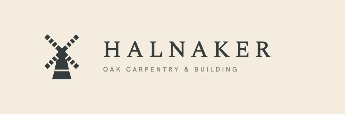

The windmill was a good mark and it went anyway. It is worth being clear why, because it is the kind of decision that gets described as taste and is usually not. The gull that replaced it holds the same qualities, a single flat silhouette that embroiders and reduces cleanly, while belonging to the harbour rather than to a hill eight miles inland. When the name stopped being defensible the mark went with it, because a mark that illustrates the wrong name is a mark with a job it cannot do.
The mark
The mark is a gull in flight, vectorised from the founder's own drawing and then refined until the wings balanced, the larger wing carried a proper curve, the body was slimmed and the beak came to a point.
One constraint shaped everything about how it was drawn. A trade mark spends most of its working life on jackets, polo shirts and van doors, and embroidery is unforgiving: a shape with an internal stroke, a counter or a second colour becomes a thread change, a registration problem and a cost. So the gull is one solid filled path with no stroke at all. Measured from the file, it is a single subpath. It takes one fill, reverses on ink or on Bancha without redrawing, and stitches as a single thread.


BIRDHAM
CARPENTRY & BUILDING
The gull on its 376.9 by 172.3 unit artboard. The drawn ink measures 376.30 by 170.51 units, a ratio of 2.207 to 1, against an artboard ratio of 2.187 to 1. The difference matters in practice: the artwork very nearly fills its box, so there is no built-in clear space and the mark must be given room by whatever places it. Because it is wide and shallow, it is always sized by height and never by width.
- Aspect ratio
- 2.21 : 1
- Measured from the drawn path
- Construction module
- 42.63 units
- A quarter of the drawn height
- Artboard
- 376.9 × 172.3
- viewBox units
- Drawn ink
- 376.30 × 170.51
- Ink ratio
- 2.207 : 1
- Artboard ratio
- 2.187 : 1
- Subpaths
- 1
- One closed shape, single fill
- Stroke
- None
- An embroidery constraint
The same path is placed at three sizes across the identity, always scaled by a single factor so the drawing is never redrawn for a context.
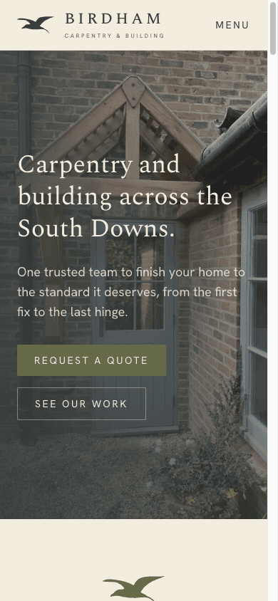
- 1Web header. Rendered at a 24 pixel height, rising to 28 at desktop. The mark is the only element in the header that is not type.
- 2Horizontal lockup. Placed at 0.255 scale on a 520 by 140 artboard, which puts the gull at 96.1 by 43.9 units with 18 units of margin to the left edge.
- 3The seal. Placed at 0.207 scale inside a double roundel of 60 and 53 unit radii on a 140 unit square, with BIRDHAM arced beneath on a 36 unit radius at 4.5 units of tracking.
18px24px32px48px96px200pxThe mark tested at working sizes. Because it is a filled silhouette with no internal detail, it survives to the favicon without a simplified cut, which is the practical payoff of the single-path constraint. The website header uses the 24 pixel height, so the second tile is what most visitors actually see.
The lockup sets BIRDHAM in Spectral capitals at a 0.2em letter-space, with Carpentry & building beneath it in Hanken Grotesk at 0.33em. The sub-line's tracking is not a stylistic pick: it is set so that the second line spans exactly the width of the first, which aligns both lines on each edge and gives the lockup a flush left and right margin. Change the words in the sub-line and the tracking has to be reset.
Lockup
- Mark height
- 24px, 28px at desktop
- Wordmark
- Spectral 500, uppercase
- Wordmark size
- 1.35rem, 1.5rem at desktop
- Wordmark tracking
- 0.2em
- Mark to wordmark gap
- 14px
- Wordmark to sub-line
- 8px
Sub-line and seal
- Sub-line
- Hanken Grotesk 500, uppercase
- Sub-line size
- 0.5rem, 0.55rem at desktop
- Sub-line tracking
- 0.33em
- Seal roundels
- r60 at 2, r53 at 1
- Seal arc
- r36, text 9pt
- Seal arc tracking
- 4.5
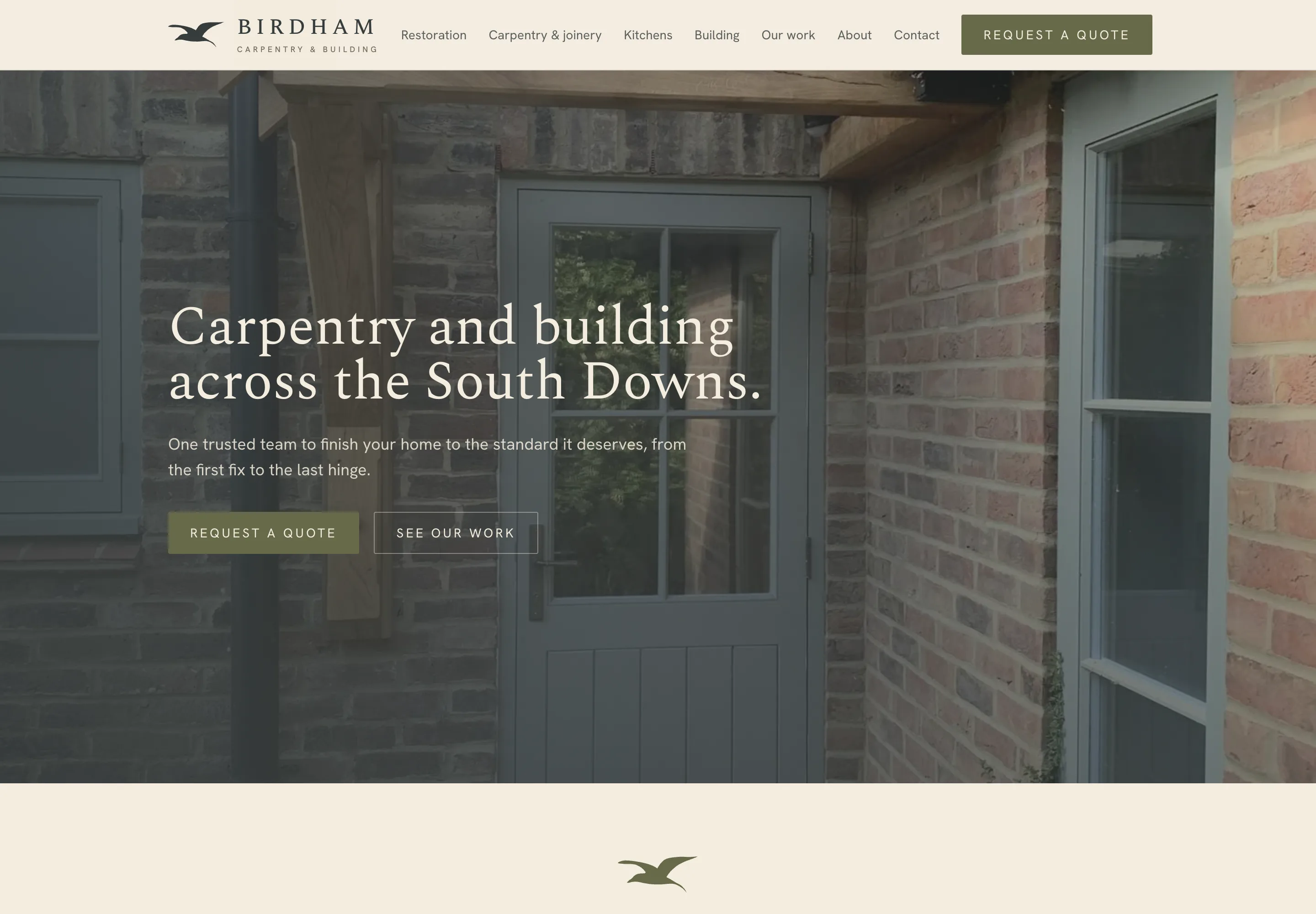
Birdham has no written brand manual. These constraints are the ones recorded in the source of the mark itself and enforced by the components that place it, which is why they are stated here as they are implemented rather than dressed up as a rules page that does not exist.
Colour
The palette is drawn from heritage paint colours rather than the bright green and gold that trade businesses tend to reach for. The three greens are real Farrow & Ball references, locked on 22 July 2026: Studio Green as the ink, Bancha as the working accent and Card Room Green as the softer secondary. The ground is a warm paper white and never pure white.
The reason is contextual rather than decorative. Most of the firm's work happens against lime render, old brick and weathered oak, and a palette taken from the paints those buildings are actually finished in sits comfortably in a photograph of the finished job.
Ink
#363C3C
54, 60, 60
Type, headers and the mark
Studio Green No.93
Bancha
#676A49
103, 106, 73
The primary brand green
Bancha No.298
Card Room
#73806E
115, 128, 110
Softer secondary green
Card Room Green No.79
Paper
#F3EDDF
243, 237, 223
Warm ground, never pure white
Surface
#FAF7EF
250, 247, 239
Slightly brighter warm surface
Stone
#726A5A
114, 106, 90
Captions and labels
Darkened to meet WCAG AA on paper
Oak
#B98A50
185, 138, 80
Decoration only. Never body text
Measured contrast
| Pair | Sample | Ratio | WCAG 2.1 |
|---|---|---|---|
| Ink on paper | Sample text | 9.6:1 | AAA |
| Stone on paper | Sample text | 4.6:1 | AA |
| Bancha on paper | Sample text | 4.8:1 | AA |
| Card Room on paper | Sample text | 3.6:1 | AA large |
| Oak on paper | Sample text | 2.6:1 | Fails |
| Paper on ink | Sample text | 9.6:1 | AAA |
| Paper on Bancha | Sample text | 4.8:1 | AA |
Ratios are computed from the hex values on this page under WCAG 2.1, not quoted from the brand document.
The contrast table above is the reason two of these colours carry usage restrictions rather than preferences. Stone was darkened during the build until it cleared the AA threshold on paper, because it sets captions and labels. Oak was left where it is and confined to rules, borders and ornament, because at its measured ratio it cannot carry text at any size. Card Room clears the large-text threshold only, so it is used for headings and panels rather than paragraphs.
Typography
The reading face changed during the build. The site opened on Libre Caslon Text and moved to Spectral, and the project README still records the older choice in one line while naming Spectral in another. Spectral sets the wordmark, the headings and the body, which is unusual for a trade site, where the convention is a workhorse sans throughout. A serif reads as considered and slightly old, which is the correct register for a firm whose lead service is listed and period restoration.
Hanken Grotesk handles the working parts: navigation, tracked-caps eyebrows, form labels and the quote flow. The division is functional. If a visitor is reading, it is Spectral. If a visitor is operating something, it is Hanken.
Spectral
Wordmark, headings and body
400, 500, 600
Letter-spaced capitals at 0.2em in the lockup, roman for headings and copy. It replaced Libre Caslon Text partway through the build.
Hanken Grotesk
Interface and labels
400, 500, 600
Navigation, tracked-caps eyebrows, the sub-line of the lockup and every working part of the quote flow.
ABCDEFGHIJKLMNOPQRSTUVWXYZ
abcdefghijklmnopqrstuvwxyz
0123456789 & £ € , . ; : ( ) “ ”
Old buildings ask to be repaired the way they were built.
Typographic tokens
- Wordmark tracking
- 0.28em
- Eyebrow tracking
- 0.18em
- Lockup tracking
- 0.2em
- Sub-line tracking
- 0.33em
- Prose measure
- 68ch
- Soft shadow
- 0 10px 34px −18px, ink at 35%
The site
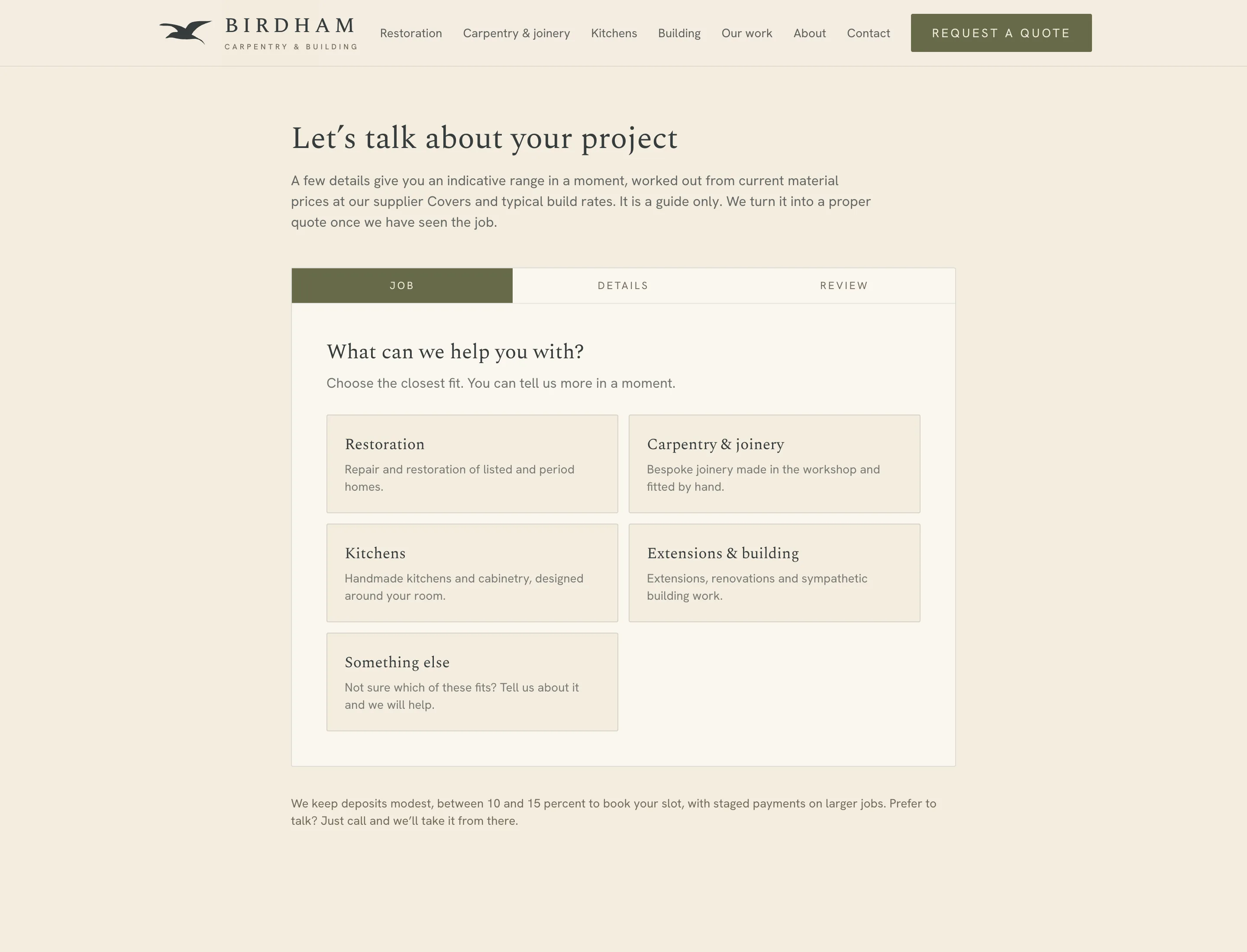
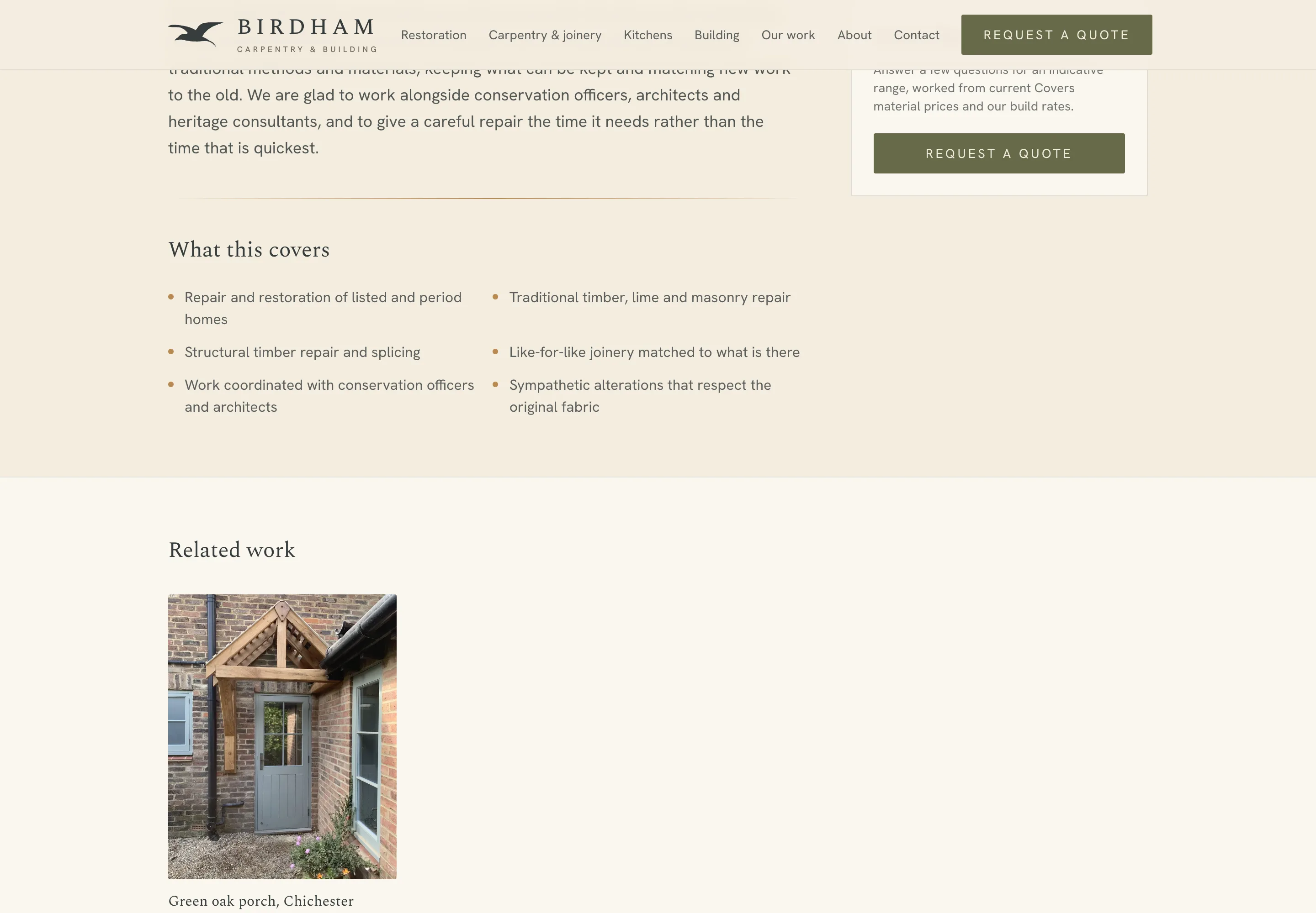
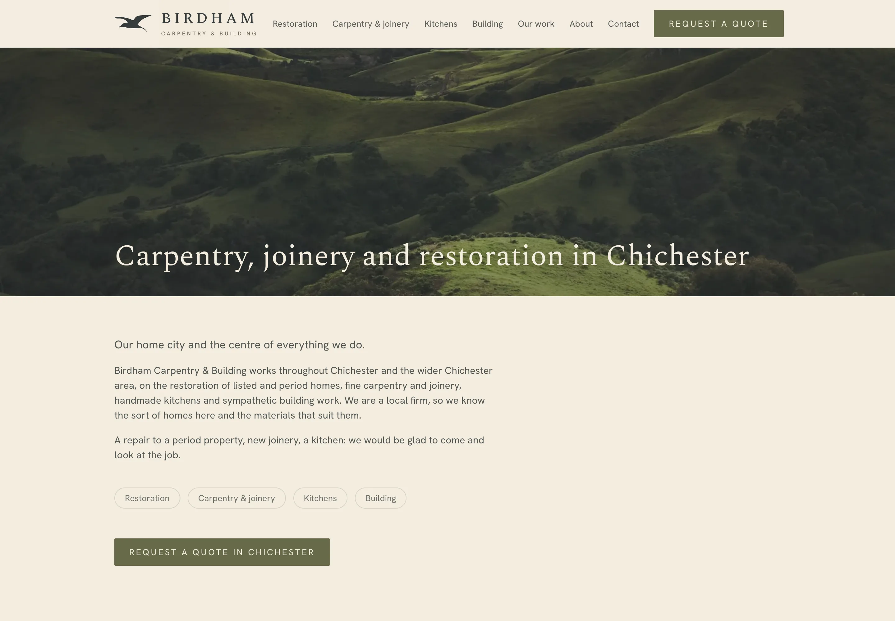
Four services lead the offer with listed and period restoration in front, and eight area pages cover the catchment from the harbour villages up to the Downs. Each area page is written individually rather than generated from a template with the place name substituted, because thin duplicate location pages are penalised and, more to the point, read as thin.
The centrepiece is the quote flow. A visitor sizes the job, chooses a standard, premium or heritage specification, and receives an indicative range on the spot, in under a minute, without speaking to anyone.
Page inventory
- Four service pagesRestoration, carpentry and joinery, kitchens, extensions and building
- Eight area pagesChichester, Goodwood, Midhurst, Petworth, Arundel, Bosham, West Wittering, Emsworth
- Quote flowSized, specified and priced to an indicative range
- Shareable quotesA tokenised link, no login, PDF download and card deposit
- Work, about, reviewsThe public pages, written in the firm's own voice
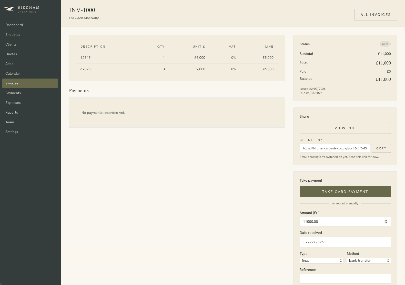
- Operations adminEnquiries, clients, quotes, jobs, calendar, invoices, payments
The estimating engine
The quote figure is computed rather than guessed. Each service carries a bill of materials expressed as a quantity per unit of size, priced against a maintained supplier list. Labour is added at a rate per unit. A specification multiplier is applied, then a margin, and the result is presented as a band rather than a single number.
The engine always returns a range and never a fixed price, and the interface says so plainly, with a firm quote to follow a site visit. That is a commercial decision as much as a technical one. An online figure presented as final is a figure the firm has to honour or retract, and retracting it is worse than never having given it.
The calculation
- Materials
- Bill of materials per unit of size
- Material prices
- Maintained supplier list
- Labour
- Rate per unit of size
- Margin
- 18%
- Indicative band
- ±15%
Specification multiplier
- Standard
- 1.00
- Premium
- 1.25
- Heritage
- 1.45
- Units
- m² or linear metres
- Output
- A range, never a fixed price
Operations
The public site is the smaller half of the build. Behind the same domain sits a role-gated admin where enquiries convert to clients, quotes convert to jobs, jobs carry stages and calendar bookings, and invoices track payments as they land. The firm runs from it rather than from a spreadsheet and a shoebox.
Quote and invoice PDFs are rendered server-side from the same React components as the on-screen versions. That is the detail that keeps the documents honest: there is no separate PDF template to fall out of step with the site, because there is only one description of what a quote looks like.
Public
Marketing site
Static. Never reads from the database
Quote flow
Sizes, specifies and prices the job
Tokenised quote link
Opened without a login, served through a security-definer function
Operations
Admin
Enquiries, clients, quotes, jobs, calendar, invoices
Row-level security
Owner, staff and bookkeeper roles separated
PDF renderer
Quotes and invoices from the same components as the screen
Money
Stripe
Deposits and payments
Idempotent webhook
Status accurate through payment, expiry and refund
Deposit
Published as 10 to 15%, defaulting to 12.5%
- •Quote links are minted as unguessable tokens, so a client opens a quote without an account and cannot reach anyone else's.
- •Deposits are published to clients as 10 to 15 percent of the job. The admin defaults to 12.5, the middle of that band, and it is adjustable on each quote rather than fixed in code, so the firm can hold to what the site promises without a developer.
- •The webhook is idempotent, so a Stripe retry cannot double-count a payment or overwrite a refund.
- •LocalBusiness, Service, FAQ and breadcrumb structured data are built from confirmed details only, with nothing invented to fill a required field.
What the homepage weighs
- Transferred
- 1.2MB
- Requests
- 33
- DOM nodes
- 303
When it paints
- First contentful paint
- 200ms
- Largest contentful paint
- 456ms
- Load complete
- 433ms
Measured on 25 September 2026 by loading birdhamcarpentry.co.uk/ twice in headless Chrome at 1440 pixels with the cache disabled, and keeping the better run. This is a desktop connection on a fast line, so the paint figures are a floor rather than a field measurement. The transfer weight and request count are the numbers worth comparing, because they do not change with the connection.
One inconsistency is worth recording. The stone tone appears at two values in the source: the darkened, accessible value used by the site, and an older, lighter value still sitting in the mark's own file. The site ships the darkened one. Anyone picking up the older file for print work should take the value from the site tokens instead.
This is how we work on every project. If it suits what you are building, we should talk.
Talk to Faro