Naming, brand, web, product
Birdham Carpentry & Building
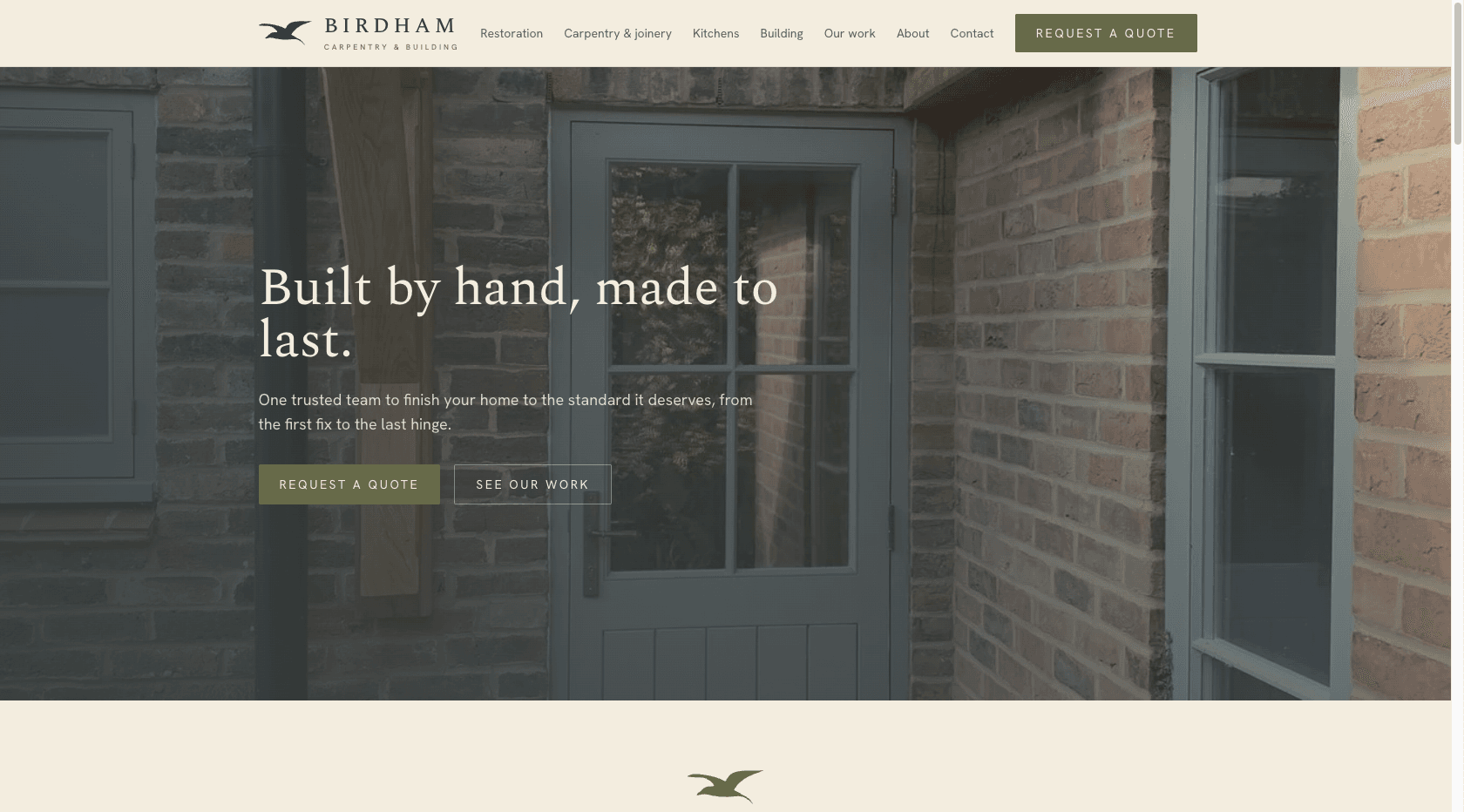
Name, brand, website and a complete quoting and payments system for a new carpentry and building firm on Chichester Harbour.
The brief
Birdham Carpentry & Building is a new firm working across Chichester and the South Downs: listed and period building restoration, fine joinery, bespoke kitchens and general building. The commission covered everything a new trade business needs to open its doors. A name, a mark, a website, and the system that runs quotes, jobs and invoices behind it.
The problem
Trade websites are either a phone number on a template or a lead portal that sells the same enquiry to three other builders. In a catchment full of listed and period property, nobody presents craft properly and nobody quotes online. The brief was to look like the most careful firm in the county from the first day of trading.
The approach
- 01Named the firm for its harbour village and drew the gull mark from a hand sketch: one solid shape that holds at favicon size and embroiders on a work jacket as a single thread.
- 02Identity set in Spectral with a palette drawn from heritage paint colours, refusing the green-and-gold defaults of the trade.
- 03Multi-step quote request priced against a maintained materials price list, producing a branded PDF quote with a shareable client link and a card deposit.
- 04Operations backend behind the same site: enquiries, clients, quotes, jobs, calendar, invoicing and payments in one place.
The identity
Birdham is a Chichester Harbour village whose name means settlement of the birds, and the mark is a gull in flight: one solid filled silhouette, vectorised from the founder's own hand drawing and then refined until the wings balanced. One path, one fill, no stroke. The constraint was embroidery, because a trade mark lives on work jackets before it lives anywhere else, and a single shape stitches as a single thread.
The lockup sets BIRDHAM in Spectral capitals, letter-spaced like an engraving, with Carpentry & building beneath in tracked Hanken Grotesk. A seal version, the gull in a double roundel, covers stationery and avatars.
The palette is taken from heritage paint colours rather than the kelly green and gold that builders default to: a deep studio-green ink, Bancha green as the working accent, warm paper instead of white, and an oak tan used sparingly. It is a palette that sits comfortably next to lime render and old brick.
One drawing serves every medium. The same path renders the website header, the favicon, the seal roundel on stationery, and the header of every quote and invoice PDF, and because it is a single shape it stitches onto a work jacket as one thread. The mark is sized by height, never width, and reverses to paper on ink or Bancha without redrawing.
BIRDHAM
CARPENTRY & BUILDING
Ink
#363C3C
Studio Green, text and mark
Bancha
#676A49
The working accent
Card Room
#73806E
Softer secondary green
Paper
#F3EDDF
Warm ground, never pure white
Oak
#B98A50
Sparing warm accent
Spectral
Wordmark, headings and body
Chosen after a full pass of eleven serifs. Letter-spaced capitals in the lockup, roman for headings and copy.
Hanken Grotesk
Interface and labels
Navigation, tracked-caps eyebrows and the working parts of the quote flow.
The site
Four services lead the offer, with listed and period building restoration in front, and eight individually written area pages cover the catchment from the harbour villages to the Downs. The centrepiece is the quote flow: a multi-step form that sizes the job, applies a standard, premium or heritage specification, and returns an indicative range on the spot, computed from a maintained materials price list plus labour rates, always presented as a guide with a firm quote to follow a visit.
Behind the same domain sits the operations side of the firm: a role-gated admin where enquiries convert to clients, quotes convert to jobs, jobs carry stages and calendar bookings, and invoices track payments as they land.
What we shipped
- Four service pagesRestoration in front, joinery, kitchens, building
- Eight area pagesChichester to Petworth, each written individually
- Quote flowSized, specified and priced to an indicative range in a moment
- Shareable quotesClients open a tokenised link, no login, with a branded PDF
- Operations adminEnquiries, clients, quotes, jobs, calendar, invoices, payments
- Work, about, reviewsThe public face, in the firm's own patient voice

The same site at 390 pixels
The build
This is a business system wearing a brochure. Supabase holds the schema, with row-level security dividing owner, staff and bookkeeper roles, and the public site never reads the database at all. Stripe takes deposits through tokenised quote links and keeps invoice status honest through an idempotent webhook. The quote and invoice PDFs are rendered server-side from the same React components as the screen versions, gull mark and all, so the brand cannot drift between mediums.
- •Estimate engine with per-service bills of materials, labour rates and specification multipliers, quoting a range, never a false fixed price.
- •Public quote links minted as unguessable tokens, served through a security-definer function.
- •Stripe deposits at 10 to 15 percent with webhook-driven status rollup and refund handling.
- •Branded A4 quote and invoice PDFs generated from React components on demand.
- •LocalBusiness, Service, FAQ and breadcrumb schema built only from confirmed facts, nothing invented.
Outcomes
- •Launched with a working enquiry-to-payment pipeline: quote request, priced PDF, deposit link, invoice, all under one roof.
- •The whole firm runs from one admin, with card deposits and payments live from day one.
- •A one-person trade brand that stands next to established heritage firms rather than other start-ups.
Stack
Framework
Next.js
Language
TypeScript
Styling
Tailwind
Data
Supabase
Payments
Stripe
Hosting
Vercel
Working on something in this space?
Talk to Faro